2018
Brief:
Create a storytelling website to compliment the carbon dashboard solution, telling the story of Capgemini's sustainability ambitions
UI designer, illustrator
Role:
Illustration, UI
Activities:

Background
Capgemini, being a consultancy, means that every week hundreds of consultants travel around the country and overseas to visit client sites. This means that some projects rack up huge carbon footprints, so Capgemini decided to hold a global hackathon to tackle this. Being a member of the winning team, I played a significant part in taking the solution forward to be built. We were asked to take the best features from across the top performing hackathon teams, and create a dashboard based solution to help project teams within Capgemini manage their carbon footprint.
Our solution
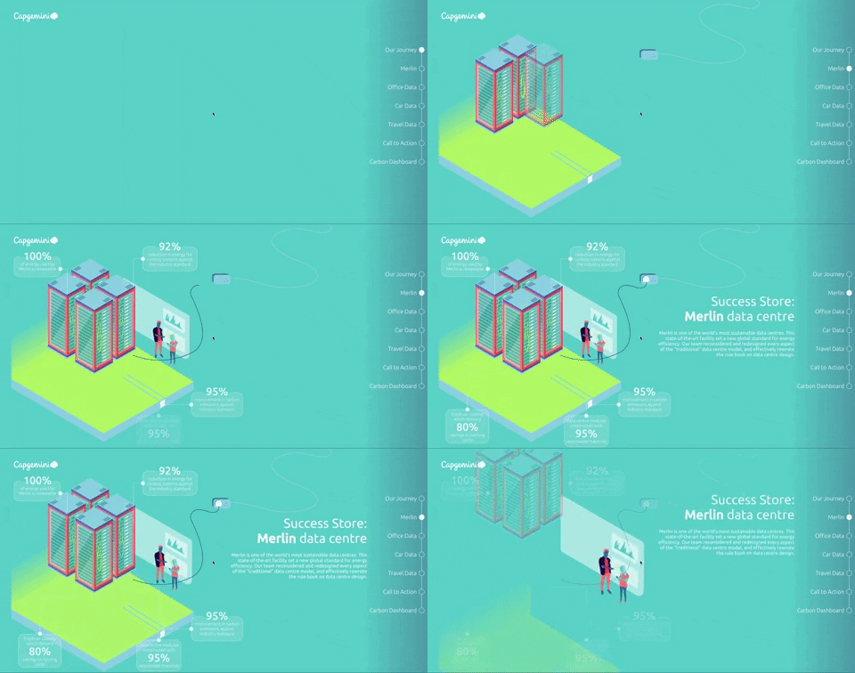
To compliment the dashboard, we also created a visually engaging story around sustainability in Capgemini - complete with success stories and dynamic data visualisations - to really bring to life the carbon footprint across the UK part of company. The main aim of this was to get buy in from employees, and help them to feel part of something big - a mission to reduce the company carbon footprint, and make better decisions regarding transport methods, overnight stays and electricity use. The website was built to perform across devices, although a more basic version exists for mobile.

Branding
I wanted to ensure that the story was inspiring and engaging, so I made full use of Capgemini's newly launched branding - which includes a bright and varied coloured palette that lends itself well to sleek, clean illustrations. I wanted to bring insight to the vast amount of data we were able to play with, and so also created a series of dynamic illustrations that bring the numbers to life.


Interaction
I used a parallax scrolling effect for some parts of the one page website to create links between the sections and to reinforce the message that these individual pieces make up a bigger picture
Data visualistion
We wanted to visually demonstrate how many flights are taken a year across all projects, so I designed a visualisation that was impactful and shows the sheer number of flights we have. We built a separate website in Mapbox
We also wanted to display which locations were the busiest for hotel stays, this is of course dependant on client office locations, however could prompt project teams to consider which consultants are allocated to which projects depending on their base location


